Butterick's Practical Typography
Matthew Butterick's online book on typography for anyone who writes: quotes, dashes, line spacing, line length, font choice and real sample documents.
What it is
Butterick's Practical Typography is a book about typography that lives entirely on the web. Its author, Matthew Butterick, is a type designer and lawyer who also wrote Typography for Lawyers. The book isn't aimed at designers. It's for anyone who writes — letters, résumés, reports, slide decks, websites. The site is now in its second edition.
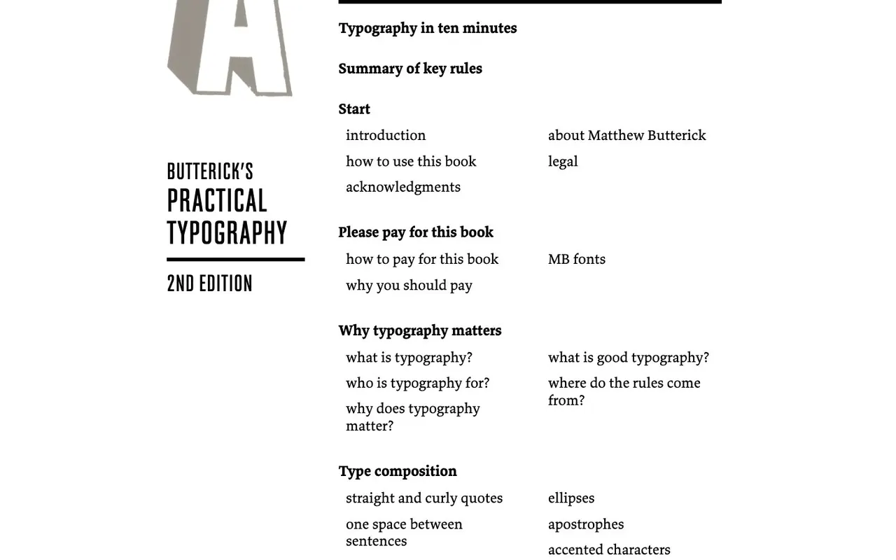
It's organised like a good reference. "Why typography matters" makes the case. "Type composition" covers straight and curly quotes, spacing, punctuation, hyphens and dashes, ligatures. "Text formatting" deals with underlining, bold and italic, all caps, point size, headings, kerning and small caps. "Font recommendations" suggests typefaces and doesn't mince words about bad ones. "Page layout" handles alignment, indents, line spacing, line length, margins, lists, tables and grids. "Sample documents" walks through real examples: a research paper, letterhead, business cards, a résumé, a presentation and a website.
Why we picked it
Most typography books are written for professionals and easy to drown in. Butterick writes for the person whose report is due tomorrow. If that's you, there's "Typography in ten minutes": five rules with real numbers. Point size of 10–12 pt in print and 15–25 px on screen. Line spacing at 120–145% of the point size. An average of 45–90 characters per line. And get the body text right before worrying about anything else. For a cheat sheet, there's "Summary of key rules".
The tone is direct and opinionated — he'll tell you plainly that Times New Roman and Arial are weak choices — and the book is set by its own rules, which is half the persuasion. There are no ads: the site has been reader-supported since 2013. Reading costs nothing, but Butterick asks you to pay what it was worth to you (suggested amounts start at $19) or to buy his fonts.
Where to start
- Open "Typography in ten minutes" and apply the five rules to whatever you're working on.
- Bookmark "Summary of key rules" as your quick reference.
- Writing a résumé? Look at the before-and-after in "Sample documents".
- For web text, read the chapters on line length and line spacing; CSS values are included.
- Browse the "Commentary" essays if you want to argue about two spaces after a period.
Who it's for
Anyone making documents or websites without a designer: students, lawyers, researchers, developers, bloggers. Designers will find it a clear, quotable ally when a client wants everything in bold caps. The rules are written for English text, so they fit English-language work without adaptation.
Quick answers
Is it free to read? Yes, the whole book is open on the site. The author asks for voluntary payment if you find it useful.
Does it cover web typography? Yes. There's guidance for the web, including CSS line-height values, and a sample website in the examples.
Who wrote it? Matthew Butterick, author of Typography for Lawyers and the typefaces used to set the book.