Hey Studio
A Barcelona graphic design studio of pure colour, geometry and type — café identities, wine labels and a homepage you can play like Pong.
What it is
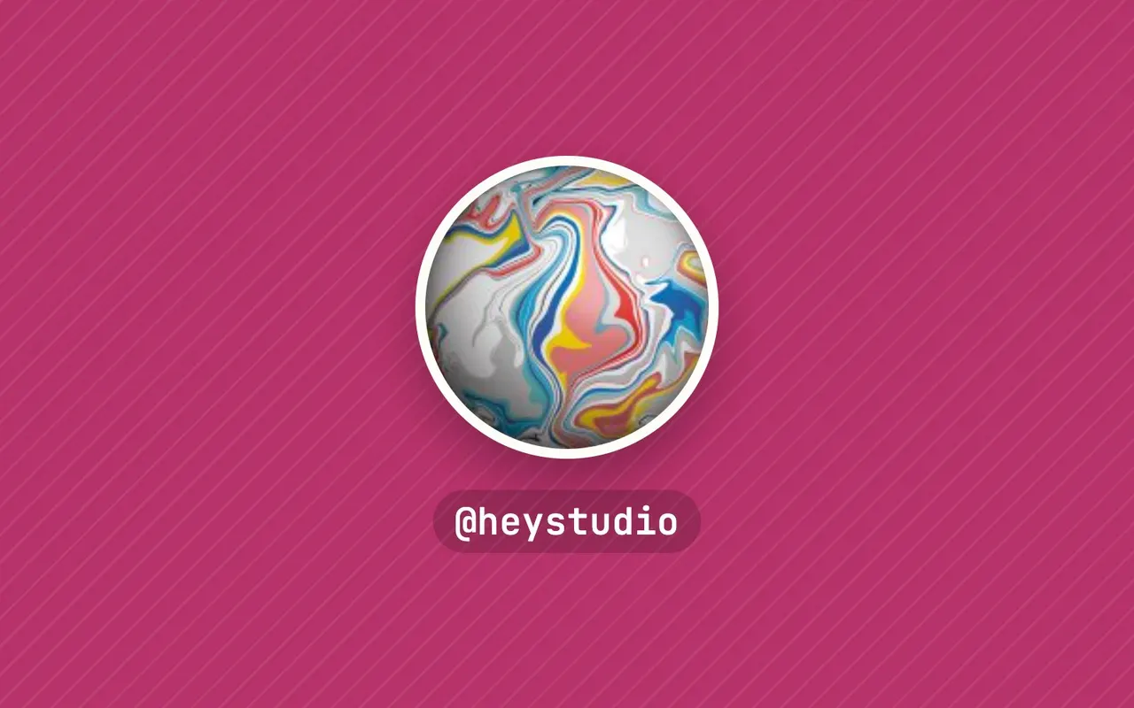
Hey is a graphic design studio in Barcelona, founded in 2007 by Verònica Fuerte and Ricardo Jorge. You can spot their work by its pure colours, geometry and direct typography: circles, stripes, big letters, nothing extra. Under the line "Visual languages that last", the studio does brand identity, packaging, illustration and editorial design. It also runs a shop, @heyshop_, and a podcast about women in design, @womenatworkbyhey.
The Instagram account has around 272,000 followers and nearly 2,200 posts. The feed works like a well-curated showcase: each project is photographed with care and comes with a short note on why it was done that way.
Why we picked it
This is graphic design that speaks without words — colour and shape do the work, and it shows even in tiny grid squares. The captions add something valuable on top: the reasoning behind the decisions.
A few projects from the feed when we checked. An identity for Julia, a speciality coffee shop: the idea was tying a bow, as on a gift, so the logo lettering was shaped by hand from a ribbon and photographed. New welcome bags for students at design school IED, with outside straps for tubes and materials, made locally in Poblenou. A natural red wine, Vi Negre, with a black scratch-off label you can draw or write on with the people you share it with. And a refresh for coworking brand Cloudworks, where one element of the old identity grew into a whole typographic language.
There are studio stories too. Hey made Creative Boom's list of the best graphic designers of 2026. The studio was one of 25 invited to the European Central Bank's design contest for future euro banknotes — the entry didn't reach the final stage, but Verònica writes that she has rarely worked with that much precision. And their new homepage is a playable version of Pong with obstacles the studio invented.
Where to start
- Find the Julia coffee shop post — a lovely case of an idea (a bow) becoming a logo.
- Look at the Vi Negre wine with the scratchable label.
- Read the euro banknote contest post for an honest take on work that didn't win.
- Scroll back through older posts to see how consistent the style stays over the years.
- Check @heyshop_ if you'd like their graphics on objects.
Who it's for
Graphic designers and students who want a crash course in colour and composition. Small business owners thinking about the identity of a café or brand. Anyone who likes bright, upbeat graphics without visual noise.
Quick answers
What language are the captions in? Mostly English, sometimes Spanish. The projects make sense from the images alone.
Is it only design work? Mostly, with occasional studio life, the shop, the podcast and charity sales.
Is it active? Yes. When we checked, the feed had a post about making a best graphic designers of 2026 list.